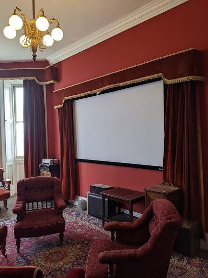
The restoration rule at Balintore Castle has been to put rooms back to their original colour if that colour is distinctive. However, if the original colour was just an off-white, then there is free licence to allow the rainbow muse to flutter down and settle on one's shoulder.
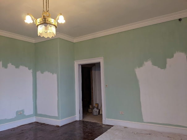
It was time to choose a colour for Aunt Nellie's bedroom which is nearing completion, as well as for the bedroom immediately above which is currently being worked on. Both rooms have the same ground plan and had been decorated in a sky blue which is an entirely fitting colour as they are upper rooms which catch the best light and can be regarded as being "up in the sky".
You may observe in Aunt Nellie's room that one light is half-off. I know why, but if anyone can explain it to me, I would be very impressed. :-) We give all newly plastered rooms a coat of white paint. This is both to seal the plaster and to check the finish.
The new window seat on the left covers up one of the very few design flaws in the building. There is an original cast iron beam inside which sticks up an inch above the floor level. The Victorians hid this by sloping the floor by an inch, but my builder naively put things back on the level, and by the time he worked out what was going on he had completed the floor. To be fair, the beam helps support the oriel window, and the alteration of a bay window to an oriel window was a very, very late design change.
 |
| Aunt Nellie's room is nearing completion |
 |
| the room above is currently being worked on |
Below, the wall paper sample from Aunt Nellie's room is bottom left; the reverse of this wallpaper is right and at the top is the wall-paper from the room above.
 |
| old wallpapers and Hydrangea |
During initial colour discussions I was stuck in England, away from my paint charts, but fortunately my builder's wife cast her skilled eye over proceedings and declared "Hydrangea" to be a close match, and indeed it is so close I was happy to go with this. However, I spotted a greener edge to the wallpaper and assumed this was the original colour stuck under an architrave, which has therefore not faded. Should one match the colour before or after fading?
On closer examination, there appeared to be a ridge where there was a change of colour and finally it emerged that the original green/blue wallpaper had been over-painted in a Hydrangea paint. Evidence includes:
- the ridge
- the brush marks
- there is a small amount of stencilled paintwork surviving with a blue-green cast.
- the rear of the wall paper is blue/green
So the question now becomes "Should one match the colour before or after the over-painting?".
We then took a closer look at the wallpaper in the room above. Rather than Hydrangea, it was the same blue-green and indeed turned out to be painted white lining paper i.e. the reverse is white. This implies the original coherent schema both upstairs and downstairs was this blue-green. And it makes sense economically to buy the same paint colour for both rooms. The blue-green colour was a little darker than "Powder Blue", a little lighter than ""Tetra" and closest to "Malted Mint".
 |
| old wallpapers and Malted Mint |
I was emotionally attached to using a blue paint for these rooms because for years they had shown evidence of their blue past. It was therefore rather disconcerting to go for a green, albeit a historically correct blue-green. One has to reconcile oneself that it is about the look not the name, and "Malted Mint" will pull the sky into the room wonderfully. In fact, once one accepts "Malted Mint" as a "blue", the Hydrangea even becomes a little violet. Both Gregor and I were amazed by how the colours changed in front of our eyes, just by placing a different colour adjacent.


